“With a map on my knees I reflected how little I knew about Burma. I did what I always do in such circumstances—reduced the map to a rough diagram with the distances between the main places marked. When you have got such a diagram into your head you have a skeleton of the terrain and can cover it with the flesh and features of further knowledge without distortion.”1
The internet groans under the weight of maps. Nonetheless, I have come to the conclusion that, when preparing a decision-forcing case or composing an article for Substack, it is often easier to make a map of my own than find an existing one that fits my purpose.
With that in mind, I offer the following step-by-step account of the making of a map that I cobbled together last month.
Step 1: The Canvas
I started at the Internet Archive, which, in addition to offering access to millions of digitized books, also preserves images of the covers that protected the real-world originals.
In the hope of finding multiple copies of The History of Plymouth Planation, I used the search terms ‘William Bradford’ (author) and ‘Plymouth’ (title). (I knew, from another project I have been working on, that this book had been a library staple for more than a century.)
The search turned up seventy-eight volumes, one of which sported a cloth cover with a combination of color and texture that suited my purpose.
Step 2: The Rough Guide
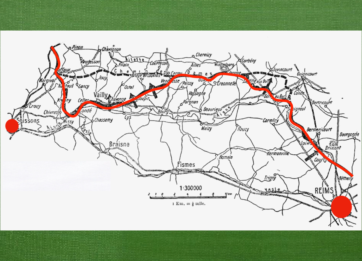
After loading my ‘canvas’ (so to speak) into Keynote, I went looking for a map that depicted some of the information I wished to convey.2 Marvelous to say, I found it on Wikipedia.
When I placed this ‘rough guide’ onto my canvas, I realized that it provided two reference points that would play a large role in my own map, the cities of Soissons and Reims.
Step 3: Scale
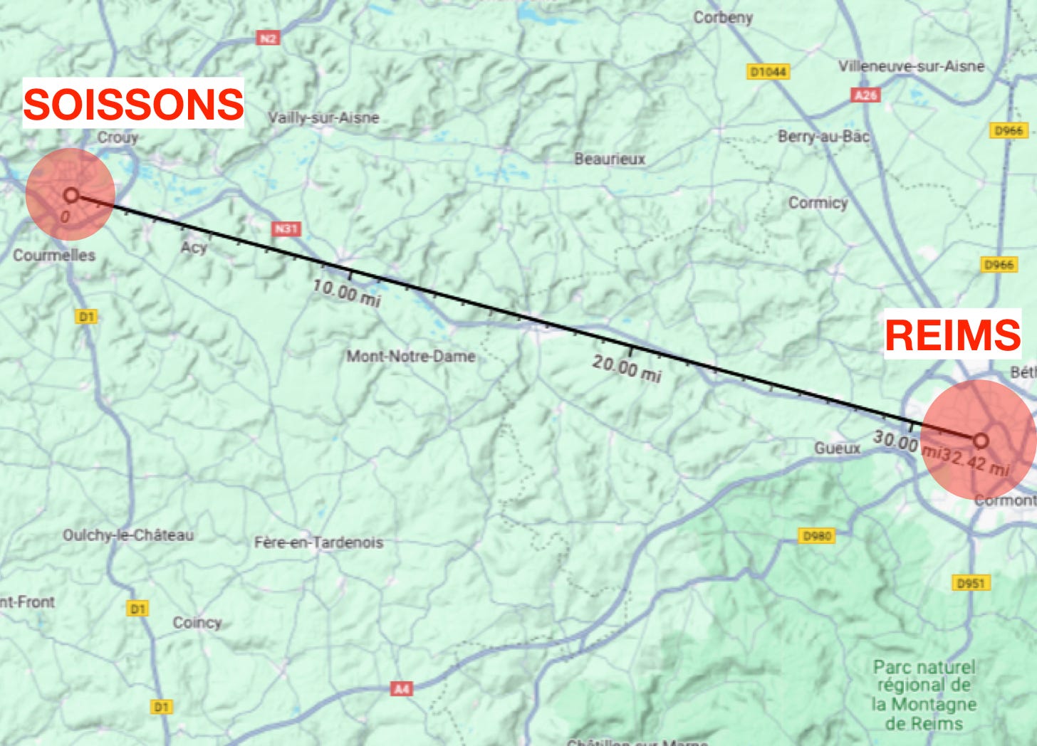
Having picked my two reference points, I located them on Google Maps, and, using the ‘measure distance’ tool, measured the distance between them.
Happily, this turned out to be a little more than fifty kilometers, which did much to facilitate future calculations. (At this point, I should remind readers to refrain from using any of my home-made maps to calculate the flight paths of ballistic missiles.)
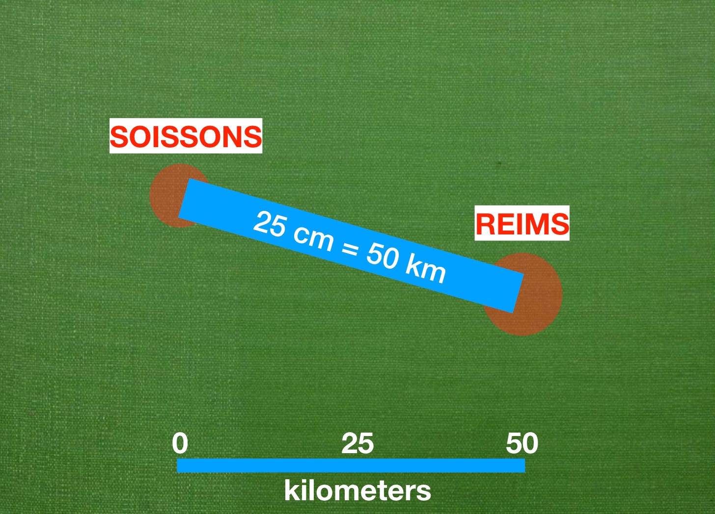
In the hope of minimizing arithmetic, I initially set the scale of my map at ‘one centimeter equals one kilometer’. However, that relationship between map and ground put my two reference points on the far edges of the page. Thus, I changed the scale to ‘one centimeter equals two kilometers’.
Step 4: Silhouettes
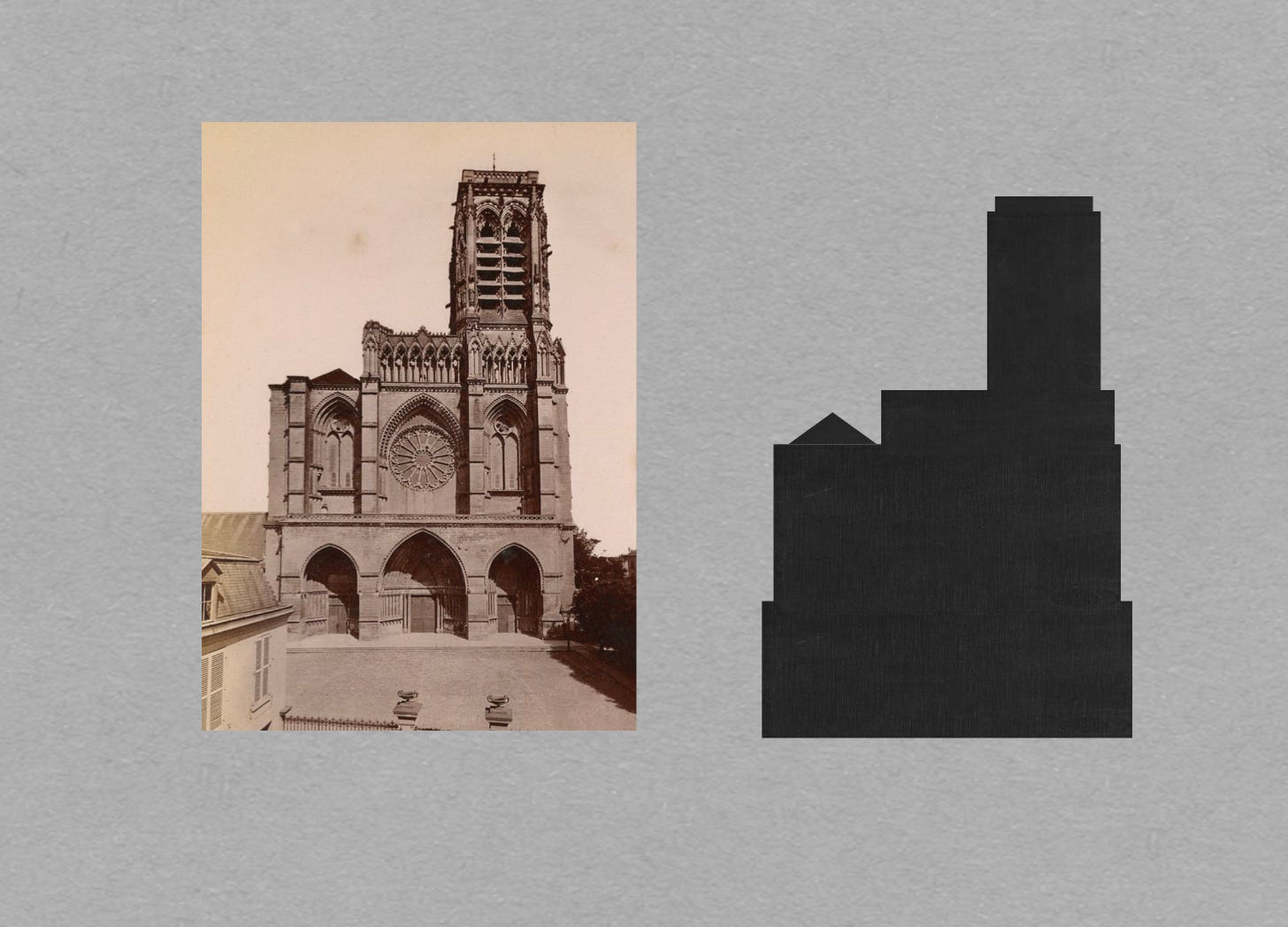
Target refuses to pay me to promote its logo. Thus, I replaced the red circles that mark reference points on early drafts of my map with with icons that celebrated famous features of the places in question. In particular, I used little images of the distinctive Gothic cathedrals of Soissons and Reims to represent those cities.
To make these icons, I used basic shapes (such as rectangles and triangles) to cover parts of a photo (or drawing) of the building in question. Then, in keeping with my fondness for texture, I filled each of those shapes with a picture that began its digital existence as a scan of a old-timey book cover.
Step 5: Fonts
Having placed my major icons and a scale of kilometers, I replaced the generic font beloved of my presentation program with a set of letters closer to my heart. (I chose Baskerville, but will not hound you if you prefer another.)
Step 6: Curves
To represent the thick belt of ‘no man’s land’ that separate French positions north of Soissons and Reims from their German counterparts, I traced the line depicted on my ‘rough guide’.
This done, I placed the resulting continuum of curves on my map, taking care to reduce its size to match the change in scale. (Unfortunately, this reduction resulted in a gap east of Reims. Thus, I was obliged to do a bit more research to come up with a reasonable approximation of the shape of the French front line in that part of the front.)
Step 7: The Final Touch
The last step in the making of this map was the addition of the symbols for the major French formations involved in the event that it depicted: the 6th Army of General Mangin and the 5th Army of General Mazel.
Earlier versions of these tactical symbols included the names of these officers. However, when depicted in letters large enough to be read by readers reading on cell phones, these names made the map too ‘busy’ for my purposes.
So, there you have it: a quick guide to the making of the sort of maps I like to make.
Answers on a Post Card
If you recognize the operation depicted on this map, feel free to use the comments section to share that information with your fellow readers.
For Further Reading:
To Share, Subscribe, or Support:
William Slim Defeat into Victory (London: MacMillan, 1986) page 19
This technique also works, mutatis mutandis, with PowerPoint.






I prefer back of MRE box and skillcraft pen.
Not sure that scales well…
US XX Corps, under Walton Walker, advanced to Reims in August 1944. This is NOT that!