Open a presentation program of some sort, whether Keynote, Impress, or PowerPoint.
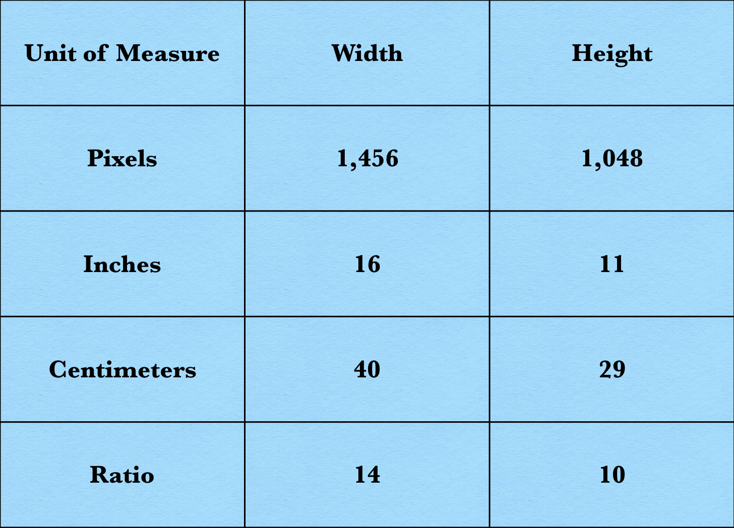
Set the width of the slide to 1,456 points and the height to 1,048 points. The resulting recumbent rectangle is your frame.
If you prefer (or your program mandates) a different way of measuring width and height, please consult the following table. (Note how big the letters are. This is for readers who are reading on their cell phones.)
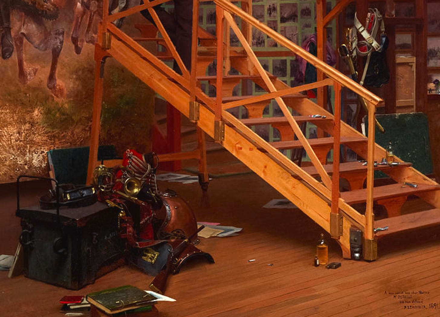
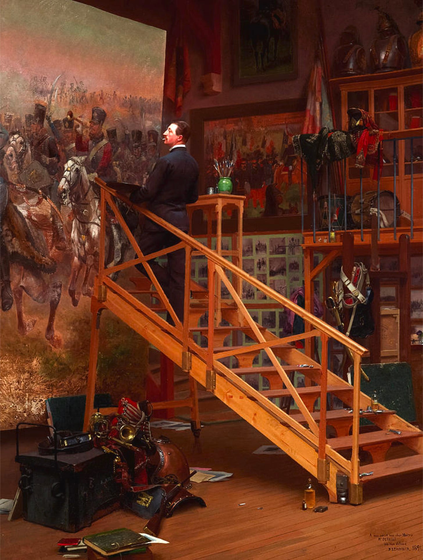
The first picture in your post should fit into your frame. In particular, if your picture is taller than the frame, Substack will, in the course of presenting your post in various ways, take a slice off the top. (The taller the original picture, the thicker the slice.)
If you wish to use a picture that is taller than 1,048 pixels, put it somewhere other than the top of the post. (The same is true for pictures shorter than 1,048 pixels.)
Whatever the height of your picture, it should be no less (and, indeed, no more) than 1,048 pixels wide. Doing this, like putting big letters on charts, makes things a lot easier for cell phone readers.
(At this point, I will apologize to all of my cell phone readers for the tiny letters that, in the past, have appeared on some of my maps, charts, and infographics. Mea culpa, mea maxima culpa, I am resolved to mend my wicked ways.)
Speaking of charts, I have learned that, for reasons I have yet to fathom, Substack sometimes does strange things to home-brew graphics that play lead guitar on posts.
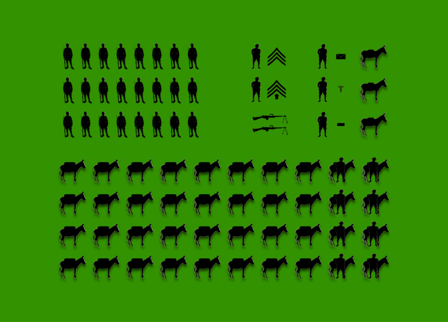
The following infographic, the work of mine own two hands, looks fine in the body of a post.
Likewise, it also fits nicely with the particular page layout that I use.
When, however, I make a small preview of the post, ‘the centre cannot hold’.
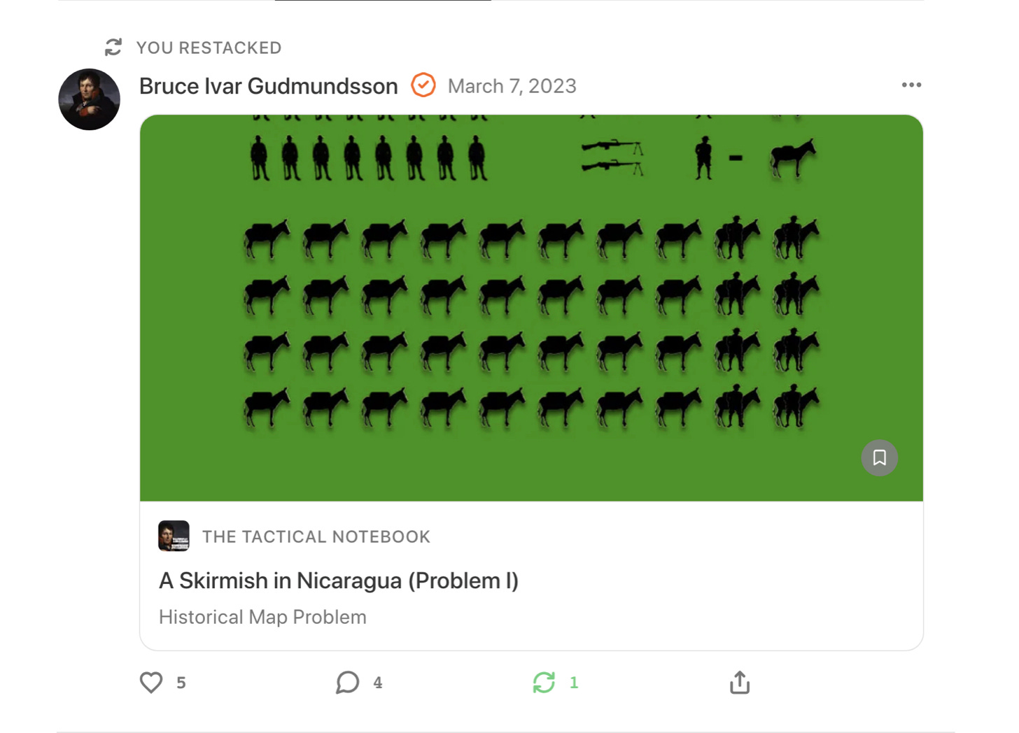
I can, with a bit of trial and error, correct this particular problem. However, fixing the way that a home-made picture appears on a small preview will not necessarily improve the way that appears in other modes. Thus, when I restack the post in question to Notes, the picture ends up looking like Citizen Robespierre after his date with Madame la Guillotine.
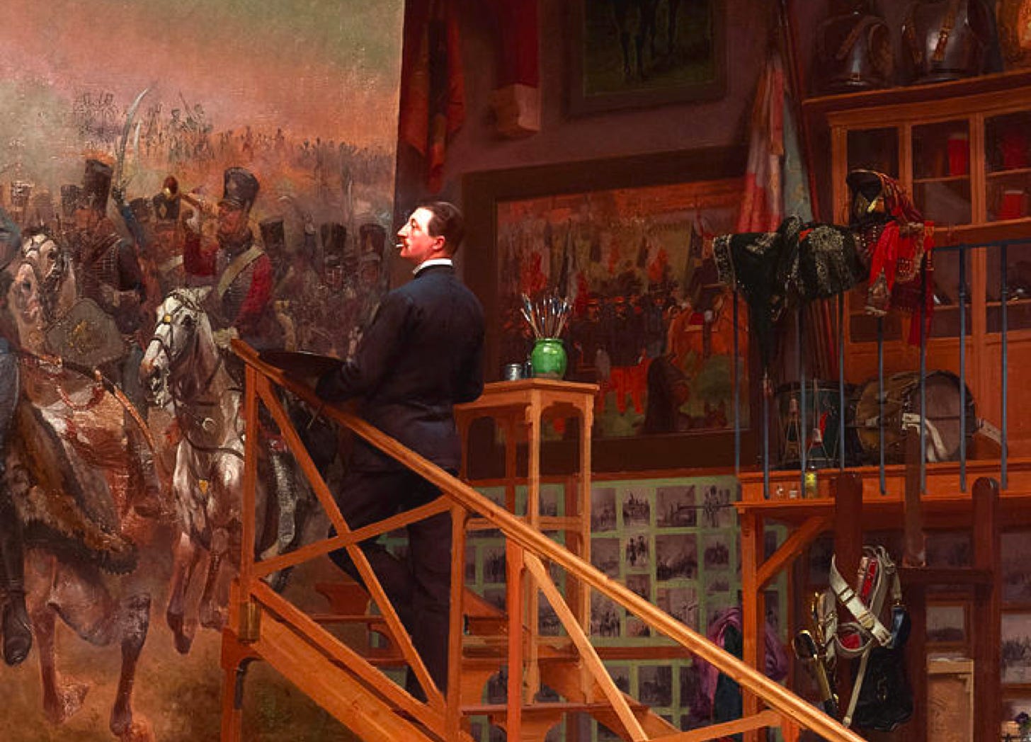
Because of this, I have adopted a policy of beginning each post with either a painting or a photograph. Moreover, to preclude possible problems with centering, I take care to place the key figure in each such picture as close to the center of frame as I can manage.
I do the same, moreover, when adding pictures to Notes.
For Further Reading:
To Subscribe, Share, or Support:



I use Wikipedia too. We must not have the same one. I have never seen these pictures before.
I appreciate this post and the thought that went into it, although I predict I will entirely neglect to heed it in the future... pictures are almost always an afterthought for me. Please don't let my future poor image quality suggest fault in your instruction :D