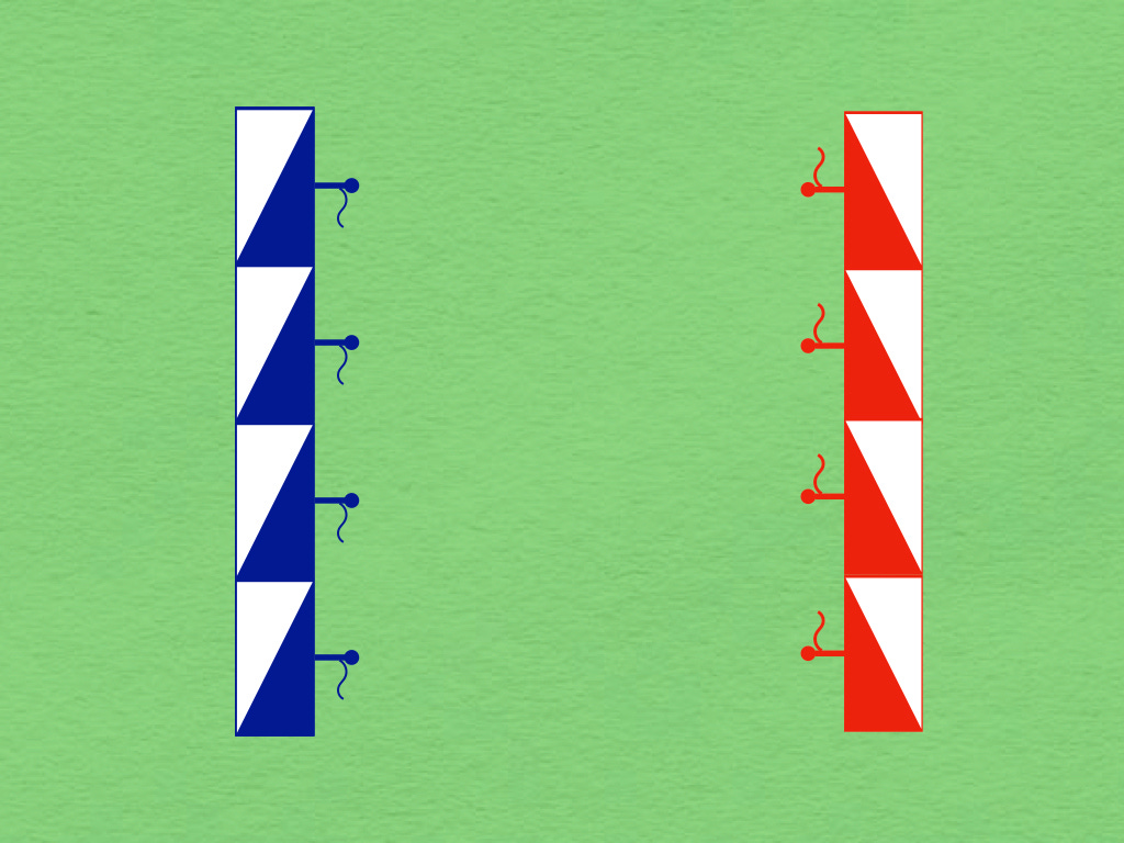
In the middle years of the nineteenth century, officers of the Prussian General Staff adopted the custom of depicting friendly forces with blue tactical symbols and hostile units with red hieroglyphs. Over the years, this led to the related practice of referring, in both speech and writing, to friendly forces as “Blue” and enemy forces as “Red.”1
In the aftermath of the Franco-Prussian War (1870-1871), the United States Army embraced several accidents of German military life. Some of these, such as the wearing of spiked helmets, failed to take root. Others, like the palm-down hand salute and the colors used to depict units on maps, became part-and-parcel of American military culture. Thus, in the splendid battle maps published with the official history of the victors of the American Civil War (War of the Rebellion), the symbols representing Union units were printed in blue ink and those indicating their Confederate counterparts were shown in red.
In the same period, French and British soldiers adopted a coloring convention in which the meaning of “red” and “blue” were reversed. Whether these decisions were related to the red trousers of French infantrymen or the British custom of correcting printer’s proofs in blue pencil is hard to say. What is certain, however, is the fact that, soon after the entry of the United States into the First World War, staff officers and map makers of the American Expeditionary Force adopted this custom, if only for the duration of the war.
Here at The Tactical Notebook, we use a variety of tactical symbols, ranging from the “NATO-adjacent” glyphs designed by Leo Niehorster to various incarnations of traditional German symbology. When, as we usually do, we draw these in color, the use of red and blue usually reflects the practice of the army to which the unit belongs. In no case, however, does the use of either color (or, for that matter, any other color) indicate support for (or opposition to) the country (or cause) served by the units in question.
The 1894 edition of the Prussian Field Service Regulations (Felddienst Ordnung) officially endorsed this practice.


