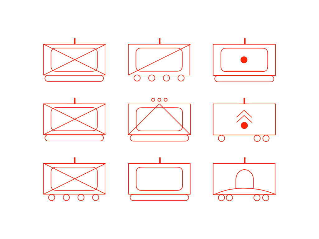
Just as the use of different fonts can modify the messages sent by printed words, comparable alternations to the style of tactical symbols can change the way that people read them. Consider the following diagram, which lays out of the combat elements of a standard Russian battalion tactical group.
By using both the color red and the diamond shape, this diagram emphasizes the hostile affiliation of the organization in question. By linking the three mechanized infantry companies to a single branch of an organizational tree, it implies that all three of those units are organized and equipped in same way. Likewise, the grouping of the two artillery batteries suggests that those two units have a great deal in common with each other.
Replacing diamonds with rectangles eliminates redundancy when it comes to the affiliation of the unit depicted. It also allows the communication of a bit of additional information. In particular, the number and distribution of the circles at the bottom of each company or battery that rides in wheeled vehicles matches the number and placement of wheels on the vehicles in question.
The avoidance of overlap lets the reader see that the two field artillery batteries - one of which is armed with self-propelled howitzers and the other with multiple rocket launchers - operate ordnance of very different types. Likewise, it allows readers to distinguish between the one motorized infantry companies equipped with wheeled vehicles and the two companies mounted in tracked carriers.


"... eliminates redundancy ... allows the communication of a bit of additional information ..."
Since we read left-to-right and up-and-down, having flat surfaces perpendicular to eye movement in effect creates little tabletops for addition stuff to go, instead of eye-poking points. Also, the rectangle is a "box" and we are used to putting things in boxes, and then labelling the boxes.
In short, the rectangles are better! The style is substantive.